


The Whisky Fringe Tasting Tracker generated a couple of hundred datapoints over the course of two days (after Neil gave it a crack on the Sunday, and a few of us had played with it on the Saturday). The data we have available is pretty simple, and associates opinions about whiskies against the times that those opinions were recorded.
This lets us look at a couple of things from the off:
- What was the sampling rate like over the course of the day? Did it get quicker near the end when time was constrained, did we start off quickly and wind down early?
- Did our sentiment towards the drams being tasted change over the course of the afternoon?
I charted some of the data using our company Scott Logic’s Visiblox charting component in a pretty rough-and-ready fashion. By way of a quick summary:
- A PHP file generates a JSON object containing the various metrics
- A custom Silverlight control hosting a Visiblox chart is coded to expose some ScriptableMember methods that directly manipulate the axes and data-series of the hosted chart, allowing Javascript on the HTML page hosting the Silverlight control to programmatically add data and configure axes
- Note that this isn’t the way the Visiblox component’s intended to be used – I did it in this way as a fun experiment, to be written up in a subsequent post
For now here’s some static images:
Sampling rate

First off we see the aggregate sampling rate. Each bar represents the total number of drams sampled (across all people using the system) in a given 15 minute time period. While the event started at 2pm, we didn’t actually get started on sampling until about 2.20pm (with the rest of the time spent actually getting into the venue and waiting for a few stragglers). Further, the tables started getting cleared at 5.45pm so there’s a corresponding lack of data there.
- Around 4pm there’s a sharp drop-off as everyone camped out at their chosen ‘half-time orange’ stand – these are the rarer whiskies of which you can try one. We also seemed to use the subsequent wee while taking a breather.
- Once the half-time orange period had ended things pick up substantially, possibly as people realised that time was no longer on our side.
- There was another minor panic right near the end of the day as the time when stands packed up approached, though it’s clear that by about 5.30 everyone was pretty much done.
Likes and dislikes
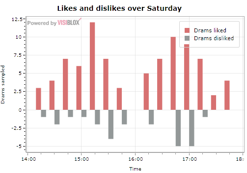
Here we’re charting the same data as above, but split out into those drams that were marked as ‘liked’ vs those marked as disliked. Dislikes are given a negative score to push them below the axis. It seems like there was a period about 45 minutes after the half-time orange where we were more critical of what we were trying, perhaps as a result of having recalibrated as a result of really liking the half-time whiskies. However, it’s a little difficult to tell (and in fairness, we don’t have enough data points with so few people using the system).
Sentiment

Sentiment’s a tricky thing to gauge. My initial attempt subtracts the number of whiskies marked as ‘disliked’ from the number marked as ‘liked’ in each 15 minute bucket, giving a net number of liked whiskies in the period. This is then divided by the total number of whiskies sampled during that 15 minute window, giving a normalised value between 0 and 1:
- Values close to 0 suggest that more whiskies were disliked than liked in the period (that is to say that sentiment was negative overall). Zero values also occur when no tasting took place (such as the 4pm half-time orange lull).
- Values close to 1 suggest that more whiskies were liked than disliked in the period (or that sentiment was positive overall).
With some of the buckets having so few samplings within them (for example, the 5.30ish bucket has only three samplings), the measure is very sensitive to noise but it’s an interesting diversion nonetheless.

